A juicy orange makes for a tastier juice: The neglected role of visual material perception in packaging design

Francesca Di Cicco *, Yuguang Zhao , Maarten W.A. Wijntjes , Sylvia C. Pont , Hendrik N.J. Schifferstein
Delft University of Technology, Department of Human-Centered Design, Landbergstraat 15, 2628CE Delft, the Netherlands
|
* Corresponding author.
Available online 18 September 2020 |
Abstract
Food appearance sets intentions and expectations. When designing packaged food much attention is devoted to packaging elements like color and shape, but less to the characteristics of the images used. To our awareness, no study has yet investigated how the appearance of the food shown on the package affects consumers’ preferences. Often, orange juice packages depict an orange. Juiciness being one of the most important parameters to assess oranges’ quality, we hypothesized that an orange with a juicier appearance on the package would improve the overall evaluation of the juice.
Using image cues found to trigger juiciness perception of oranges depicted in 17th century paintings, we designed four orange juice packages by manipulating the highlights on the pulp (present vs. absent) and the state of the orange (unpeeled vs. peeled).
In an online experiment, 400 participants, each assigned to one condition, rated expected naturalness, healthiness, quality, sweetness and tastiness of the juice, package attractiveness and willingness to buy. Finally, they rated juiciness of the orange for all four images.
A one-way ANOVA showed a significant effect of the highlights on juiciness. A MANOVA showed that the presence of highlights, both in isolation and in interaction with the peeled side, also significantly increased expected quality and tastiness of the juice.
The present study shows the importance of material perception and food texture appearance in the imagery of food packaging. We suggest that knowledge from vision science on image features and material perception should be integrated into the process of packaging design.
Keywords
1. Introduction
Product packaging plays an influential role in guiding the in-store purchase decisions of consumers. For instance, the packaging shape and color contribute significantly in guiding consumers’ first impression of a product seen from a distance and at an angle on retail shelves (Garber, Hyatt, & Boya, 2008). The processing of visual packaging cues tends to dominate the purchase decision process (Schifferstein et al., 2013). On the basis of the packaging characteristics people see, they try to predict how the product will taste (Schifferstein et al., 2013). Hence, the design of food product packages can have a major effect on how its content is experienced during consumption. Studies have demonstrated that packaging shape (Velasco et al., 2016) and color (Garber et al., 2008) affect the expectations consumers have when they open a package and consume its content.
Besides shape and color, imagery is another extrinsic cue contributing to build expectations and sensory experiences (Piqueras-Fiszman & Spence, 2015). A congruent and pleasant image on orange juice packaging has been shown to affect its taste, by improving palatability, freshness and aroma perception (Mizutani et al., 2010). In a recent review, Gil-Pérez, Rebollar and Lidón (2020) summarized the last decade of research on the effect of various elements of packaging imagery on consumers’ perception and expectations, offering a framework to use these findings to promote healthy eating behaviors.
In the current paper, we are particularly interested in the role of images on orange juice packages. Orange juice is consumed worldwide, and a glass of 100% fruit juice can account for one of the five daily recommended portions of fruits and vegetables, representing a healthier alternative to carbonated beverages. Images on orange juice packages usually depict a glass of juice or an orange shown either entire or cut in half. A topic that has been largely neglected thus far is the role of the visualization of the material properties of the objects depicted in the package image. Material perception can be easily overlooked, since it is something that people evaluate effortlessly on a daily basis when, for example, they judge the ripeness of an apple or the slipperiness of a floor. Studies on material perception in food packaging have considered only the material properties of the packaging itself, showing that glossy packaging materials are associated with high fat levels (De Kerpel, Kobuszewski Volles, & Van Kerckhove, 2020) and tastiness (Ye, Morrin & Kampfer 2019). No study, to the best of our knowledge, has looked into the perceived material properties of the product presented in the packaging imagery.
Studies have shown that the visual features of food can affect the perception of properties responsible for food quality, like freshness. Changes in freshness perception of fish (Murakoshi, Masuda, Utsumi, Tsubota, Wada, 2013), fruits and vegetables (Arce-Lopera, Masuda, Kimura, Wada, & Okajima, 2015) were shown to be related to the luminance distribution of the food image. Despite this critical role that food appearance plays on consumers’ perception and acceptability of products, a thorough understanding of its effect in packaging imagery is still missing.
In this paper we aim to address this gap by investigating how the visual perception of juiciness of an orange shown on the package of orange juice affects the inferred properties of the product.
Juiciness is a key textural property of food, mainly dependent on the amount of juice and its rate of release during chewing (Szczesniak, 2002). It is usually studied in relation with in-mouth perception using trained sensory panels (Harker, Amos, Echeverría, & Gunson, 2006), or via physical measurements to determine food quality (Guthrie et al., 2005). To understand how juiciness can be visually communicated and how it is estimated, it is necessary to know the image cues that trigger its perception. One research approach consists in unraveling the implicit knowledge of painters by using images of paintings as experimental stimuli. Paintings are considered a corpus of perceptual experiments by vision scientists (Cavanagh, 2005), since painters have been studying the key image cues exploited by the human visual system to perceive material properties for centuries. In a psychophysical study on visual perception of the juiciness of citrus fruits depicted in 17th century paintings (Di Cicco, Wijntjes, & Pont, 2020), the authors identified the ‘highlights on the pulp’ and the ‘peeled side’ of the fruits as the image features that most contributed to perceived juiciness. Therefore, the hypotheses of the present study are:
- H1: The presence (absence) of the features ‘highlights’ and ‘peeled side’ in the image would result in a significantly higher (lower) perception of juiciness of the orange shown in the packaging imagery.
- H2: The image of an orange with a juicier (less juicy) appearance on the packaging would enhance (decrease) the expected quality, naturalness, healthiness, and tastiness of the juice, and therefore the willingness to buy.
2. Method
2.1. Stimuli
To systematically vary the visual perception of juiciness, we adopted the image features found to be associated with it, ‘highlights on the pulp’ and the ‘peeled side’ of the fruits (Di Cicco et al., 2020). In agreement with these findings, we designed four stimuli following a 2 × 2 design via digital manipulation of the highlights on the pulp (present vs. absent) and physical manipulation of the state of the orange (unpeeled vs. peeled). The digital manipulation and the design of the packages were done using Adobe Photoshop (CC 2017.0.1). The stimuli are shown in Fig. 1.
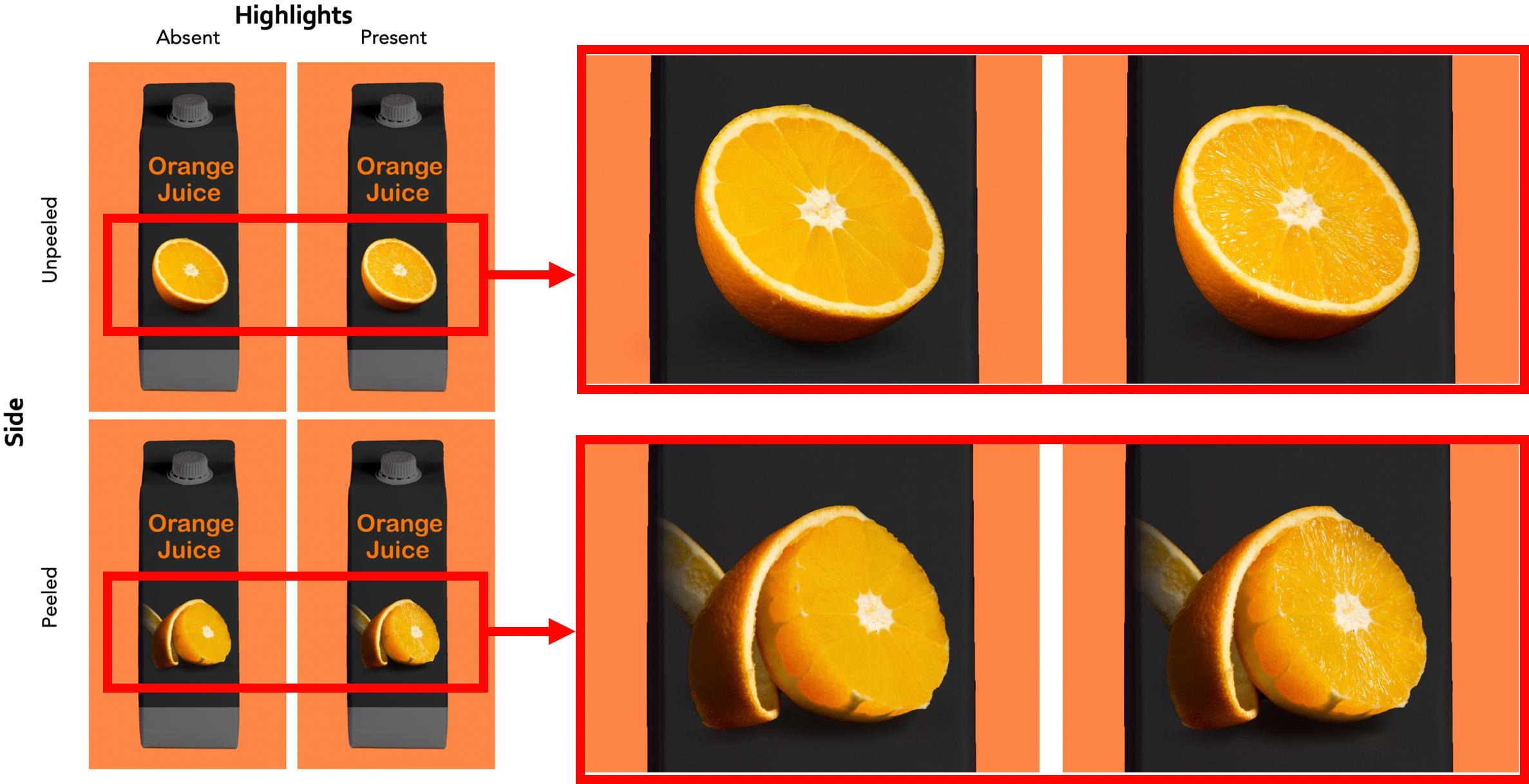
Fig. 1. Stimulus set with zoomed-in version on the orange images and the features manipulated. (For interpretation of the references to color in this figure legend, the reader is referred to the web version of this article.)
2.2. Participants
Four groups of 100 participants were recruited online through the Amazon Mechanical Turk (AMT) platform. Each participant was randomly assigned to one of the four conditions and rated a set of attributes. Participants with a rating time below 1 s were removed, as we assumed they were just rushing through the experiment to increase their financial gain. Such participants’ sampling resulted in a total of 359 participants, circa 90 per condition.
All participants were naïve to the purpose of the experiment. They agreed to the informed consent prior to the experiment. The experiment was conducted in agreement with the Declaration of Helsinki and approved by the Human Research Ethics Committee of Delft University of Technology.
2.3. Procedure
The experiment was coded in Python, using the Boto3 package to communicate to Amazon Mechanical Turk. The experiment consisted of two parts. In the first part, participants were presented with one of the packages from the four conditions following a between-subject design. In this part of the experiment they were asked to rate naturalness, healthiness, quality, and the expected sweetness and tastiness of the juice, the attractiveness of the package, and the willingness to buy. The ratings were done using a slider on a continuum, ranging from 0 to 100, with the anchoring points being ‘low’ and ‘high’, respectively. In the second part of the experiment, all participants rated the perceived juiciness of the orange in the image for all four conditions following a within-subject design. Before starting the actual rating in the second part, participants did four practice trials that were meant to give them an overview of the stimuli to set an internal scale for the ratings. After the practice trials, they rated the juiciness of the orange shown in the image, using the same slider as in the first part, ranging on a continuum from 0 (low) to 100 (high). The four trials in the second part were randomized across participants.
3. Results
We will first report the outcomes of the second part of the study about juiciness perception of the four stimuli, before reporting the outcomes of the first part of the study about the overall evaluation of the juice in each of the four conditions.
3.1. Effect of visual cues on juiciness perception
In the second part of the experiment, all participants rated juiciness for all four conditions. To test whether the manipulation of the visual cues affected the visual perception of the juiciness of the oranges shown on the packages, we performed a two-way repeated measures ANOVA, with ‘highlights on the pulp’ and ‘peeled side’ as independent variables and perceived juiciness as dependent variable. Juiciness perception of the orange increased significantly with the presence of the highlights (F(1, 358) = 34.05, p < .001, η2partial = 0.087), whereas the peeled side caused no significant increase (F(1, 358) = 0.305, p > .05, η2partial = 0.001). The mean values and the standard errors of the four conditions are reported in Table 1.
Table 1. Mean and standard errors of the juiciness ratings in the four conditions.
| Condition | Mean | Standard error |
|---|---|---|
| Highlights – peeled side | 0.65 | 0.014 |
| No highlights – peeled side | 0.58 | 0.016 |
| Highlights – unpeeled side | 0.64 | 0.014 |
| No highlights – unpeeled side | 0.56 | 0.016 |
The interaction effect between highlights and peeled side was also not significant (F(1, 358) = 0.5, p > .05, η2partial = 0.001). This indicates that highlights on the pulp of the orange triggered a significantly higher perception of juiciness than if they were not present, regardless of the state of the orange being peeled or not.
3.2. Effect of visual cues on product’s assessment
We conducted a MANOVA to examine the effect of the presence of the visual cues ‘highlights on the pulp’ and ‘peeled side’ as independent variables, on the expected naturalness, healthiness, quality, sweetness and tastiness of the juice, attractiveness of the package, and the willingness to buy, as dependent variables.
We found a main effect of the presence of the highlights on expected quality (F(1, 355) = 4.1, p < .05, η2partial = 0.011) and tastiness of the juice (F(1, 355) = 4.7, p < .05, η2partial = 0.013). The main effect of peeling the side of the orange was not significant for any of the attributes (F ranged from 2.1 to 0.1, p > .05). However, there was a significant interaction effect of the presence of the highlights with the peeling of the orange for the quality and taste of the juice (F(1, 355) = 5.1, η2partial = 0.014 for quality and F(1, 355) = 3.7, η2partial = 0.01 for tastiness, p < .05). Peeling the orange resulted in a larger effect on the quality and tastiness of the juice for oranges with highlights (M = 0.58, SE = 0.29 for quality; M = 0.73, SE = 0.26 for tastiness), than for oranges without highlights (M = 0.45, SE = 0.30 for quality; M = 0.61, SE = 0.27 for tastiness).
3.3. Mediation analysis
We found that the presence of highlights on the pulp of the orange shown in the package’s imagery was related to a significant increase in juiciness perception of the orange in the image, as well as an increase in expected quality and tastiness of the juice. Therefore, we were interested to know whether consumers expected the juice to be of higher quality and taste better for images of oranges with highlights, because they perceived the orange to be juicier. Or, in other words, we wanted to test whether juiciness perception of the orange acted as a mediator on expected quality and tastiness of the juice. To test the significance of the indirect effect we performed a biased-corrected bootstrapping procedure with 10.000 samples (PROCESS, model 4, Hayes, 2013). The 95% confidence interval (CI) of the indirect effect included zero both for quality (−0.02 to 0.06) and for tastiness (−0.02 to 0.08), indicating that the indirect effect of the highlights on expected quality and tastiness of the juice through juiciness perception of the orange, was not significant. However, a linear regression with juiciness predicting quality and taste, showed that the juiciness of the orange on the package was related to the tastiness (b = 0.29, p = .000) and quality (b = 0.22, p = .002) of the juice.
4. Discussion
Building on the research on material perception and on food packaging imagery, in this study we investigated the role that juiciness perception of an orange displayed on the package of orange juice plays in product evaluation. We first tested how the perceived juiciness of the orange changed when manipulating the presence of the image features found to trigger juiciness perception, i.e. the presence of highlights and the peeled side (Di Cicco et al., 2020). The visual perception of juiciness may not be an often discussed topic in the scientific perception literature, but it is well-known to professionals who convincingly render material properties, like painters, graphic designers or food photographers. For example, to make a burger look juicy in a photo, the trick is to spray it with oil to increase the amount of specularly reflected light. In agreement with this “implicit” knowledge, our results showed a significant effect of highlights on juiciness perception. The presence of highlights on the pulp of the orange reveals the three-dimensional shape of the cells (Ho, Landy, & Maloney, 2008), i.e. whether they are round and swollen with juice or flat and dry. This gives a straightforward indication of the amount of juice present, that people can adopt to estimate how juicy the orange would be. The peeled side on the contrary, had no significant effect on juiciness perception of the orange in the image. Peeling an orange on the side adds a cue for translucency perception by increasing the visibility of the light gradient. Juiciness is related to translucency, since the juice contained in the cells acts as medium that allows the light to scatter within the orange pulp. However, the present study suggests that translucency alone is not strong enough as a cue to increase juiciness perception. A peeled side can also reveal the bumpiness of the cells swollen with juice, and thus contribute to juiciness perception, but the bumpiness may be perceived to be more articulated in combination with the highlights (Ho, Landy, & Maloney, 2008).
The MANOVA results indicated that the presence of highlights on the orange pulp significantly increased expected quality and tastiness of the juice. The peeled side showed no significant effect in isolation, but it showed a significant interaction effect where peeling in the presence of highlights increased the expected quality and taste of the juice. The MANOVA also showed that the image manipulations did not affect the other attributes. Naturalness and healthiness were likely not influenced because an image of an orange was shown in all four testing conditions, and showing the ingredient in its unprocessed form is often associated with the perception of a natural and healthy product (Machiels & Karnal, 2016). The non-significant effect on purchase intentions was unexpected, considering the increase in expected quality and taste evaluation. Possibly, our stimulus set did not offer sufficient variations to induce a significant difference in willingness to buy, since the image of the orange was always congruent with the product category.
Mediation analysis did not confirm that the presence of highlights increased expected quality and taste evaluations, because the orange in the image was perceived to be juicier. However, the regression coefficients of juiciness on taste and quality evaluations were both positive and significant, suggesting that as juiciness perception of the orange image increased, the expected quality and tastiness of the juice also tended to increase.
Even though no studies so far have looked into the effect of the material properties of the food shown in packaging imagery, several researchers have investigated the role of food textural properties on consumers’ liking and acceptance. Our results on the effect of the highlights are in good agreement with studies that identified glossiness as a critical surface property for consumers’ liking and sensory evaluation of diverse food products, like chocolate (Krasnow & Migoya, 2015), fruits and vegetables (Arce-Lopera et al., 2015), and fish (Murakoshi et al., 2013).
One limitation of our approach, which should be addressed in a future study, was that our stimulus set relied solely on attributes inference based on implicit cues, i.e. the image features. This could have required an enhanced cognitive effort, which not all participants may have been able or willing to make (Machiels & Karnal, 2016). It would be interesting to see if including explicit textual information could increase the effect on product quality and tastiness expectations.
The main aim of the present study was to draw the attention of packaging designers and food industries to the importance of the visual appearance and material perception of food presented in the packaging imagery. It is a popular saying that “we eat we our eyes first”, as the visual experience of food appearance is usually the first way how we interact with a product, setting intentions and expectations (Schifferstein et al., 2013). As surface textural properties of food can deeply affect consumers’ perception of the product (Chen, 2007), we propose to integrate multidisciplinary insights from vision science and material perception into making better informed decisions in the process of packaging design. The first step should be finding which image cues trigger the perception of an intended material property, and then integrate these cues in the imagery shown on the package. This study, for example, demonstrated that adding highlights on the pulp of the depicted orange contributes to communicate the juiciness of the oranges squeezed to make the juice. This is necessary because only by knowing which image cues trigger the perception of the desired material property, it is possible to visually communicate the intended message to consumers effectively.
5. Conclusion
In this study, we showed that material perception of the food shown on the package influences consumers’ evaluation of the packaging content. More specifically, we manipulated the image features that contribute to the visual perception of juiciness of oranges, i.e. the highlights on the pulp and the peeled side. We hypothesized that the image of a juicy orange on the package, would elicit a better overall impression of the orange juice. This hypothesis was confirmed, at least for certain attributes, as we found that juiciness perception was positively correlated with expected quality and tastiness of the juice. The presence of the highlights on the orange pulp significantly increased juiciness perception of the orange, and the interaction of highlights with the peeled side, showed a significant effect on expected quality, and tastiness of the juice.
In terms of practical applications of this study, we recommend to include insights from vision science to improve design decision making for packaging design.
CRediT authorship contribution statement
Francesca Di Cicco: Conceptualization, Methodology, Formal analysis, Writing - original draft. Yuguang Zhao: Software, Investigation. Maarten W.A. Wijntjes: Supervision, Funding acquisition, Writing - review & editing. Sylvia C. Pont: Supervision, Funding acquisition, Writing - review & editing. Hendrik N.J. Schifferstein: Conceptualization, Formal analysis, Writing - review & editing.
Acknowledgements
Funding: This work was supported by the Netherlands Organization for Scientific Research (NWO) [NICAS “Recipes and Realities” project number 628.007.005 awarded to Jeroen Stumpel and Sylvia C. Pont; VIDI “Visual communication of material properties” project number 276.54.001 awarded to Maarten W.A. Wijntjes]; and by Delft University of Technology.
References


